Content Menu
● At a glance: choosing a bikini color
● Use undertone as a starting point—not a restriction
● Choose based on contrast and the effect you want
● Think about where and how the bikini will be worn
● Fabric surface and stretch can alter appearance
● Check prints at finished-garment scale
● A practical bikini color approval checklist
● What to include in a color brief for an OEM supplier
● 1. What is the best color for a bikini?
● 2. How do I choose a bikini color for my skin tone?
● 3. Why does a bikini color look different from the online image?
● 4. How should a brand approve bikini colors for production?
● 5. Howmany colors should a swimwear collection include?
● 6. What should I send an OEM factory when requesting a color sample?
Choosing bikini colors is not only a matter of taste. For swimwear brands, the right palette must work across skin tones, prints, fabrics, production methods, and the customer's intended use. A shade that looks striking on a screen may appear different in daylight, change when the fabric stretches, or be difficult to reproduce consistently in bulk.
This guide brings together practical color-selection advice for shoppers and product teams. It also covers how to evaluate bikini colors before sampling and production. No existing draft or customer comments were included in your message, so this version is a fresh, industry-informed guide rather than a direct integration of supplied material.
> Editorial note: The guidance below is general product-development advice. Color appearance depends on the fabric, dye, lighting, construction, and individual preference; it should not be treated as a universal rule for every wearer or material.
At a glance: choosing a bikini color
- For a timeless collection: Start with black, navy, and a small group of versatile seasonal colors.
- For a bold beach look: Test saturated shades such as coral, turquoise, or bright pink on the actual fabric.
- For prints: Check contrast, scale, and legibility at the garment's finished size.
- For production: Approve a physical lab dip or fabric swatch under consistent lighting before bulk dyeing.
- For a brand collection: Select colors by customer, channel, season, and product role—not just by trend.
## How to Choose Bikini Colors for Your Skin Tone and Personal Style
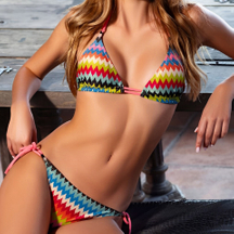
A color guide can offer inspiration, but there is no single "correct" bikini color for a skin tone. Undertone charts are starting points, not rules. Personal style, contrast preference, print design, and the occasion all influence what feels right.
Use undertone as a starting point—not a restriction
Some shoppers enjoy comparing warm, cool, or neutral undertones when narrowing down colors:
- Warm-leaning palettes: Coral, tomato red, warm orange, olive, and golden yellow.
- Cool-leaning palettes: Cobalt, blue-red, berry, lavender, and emerald.
- Neutral palettes: Black, navy, teal, chocolate, and balanced pinks.
These are broad styling suggestions, not guaranteed matches. A warm coral may look different depending on its brightness and the fabric surface. Try the actual garment in natural light whenever possible.
Choose based on contrast and the effect you want
Think about the visual effect you want rather than looking for a shade that supposedly "must" suit you.
- High contrast: Strong, saturated colors and clear light-dark combinations can create a striking look.
- Low contrast: Softer shades and tonal combinations create a more blended effect.
- Minimalist style: Black, navy, cream, or a single-color set can keep the look simple.
- Playful style: Color blocking, florals, stripes, and multicolor prints add visual energy.
Fit and confidence matter more than following a color rule. A well-fitting bikini in a color you enjoy is often a better choice than a supposedly "flattering" shade you would not wear.
## Best Bikini Colors for Different Swimwear Product Goals
For brands and product developers, the same color can serve different roles depending on the collection.
| Product goal | Color direction to test | Product-development consideration |
| Core basics | Black, navy, chocolate, cream | Prioritize repeatability and fabric opacity |
| Resort or vacation collection | Turquoise, coral, tropical prints | Check print color balance and garment scale |
| Sport-inspired swimwear | Cobalt, red, high-contrast color blocking | Test color consistency across panels and trims |
| Soft, understated collection | Muted blue, sage, dusty pink | Review shades under daylight and retail lighting |
| Statement styles | Neon or highly saturated colors | Confirm dye availability, visual intensity, and bulk consistency |
A balanced range usually needs both continuity and novelty. Core colors can support replenishment, while a smaller number of seasonal shades give customers a reason to explore new styles.
Think about where and how the bikini will be worn
Color choice may depend on the product's use. A poolside fashion set, a surf-inspired bikini, and a resort capsule do not necessarily need the same palette. Ask:
1. Who is the target customer? Consider their style preferences and the markets where the product will be sold.
2. What is the product's role? Is it a core item, a seasonal statement, or part of a coordinated range?
3. Where will customers encounter it? Online photography, shop lighting, and outdoor settings can show colors differently.
4. Will it coordinate with other pieces? Check cover-ups, bottoms, accessories, and complementary styles together.
## How Print, Fabric, and Construction Change Color
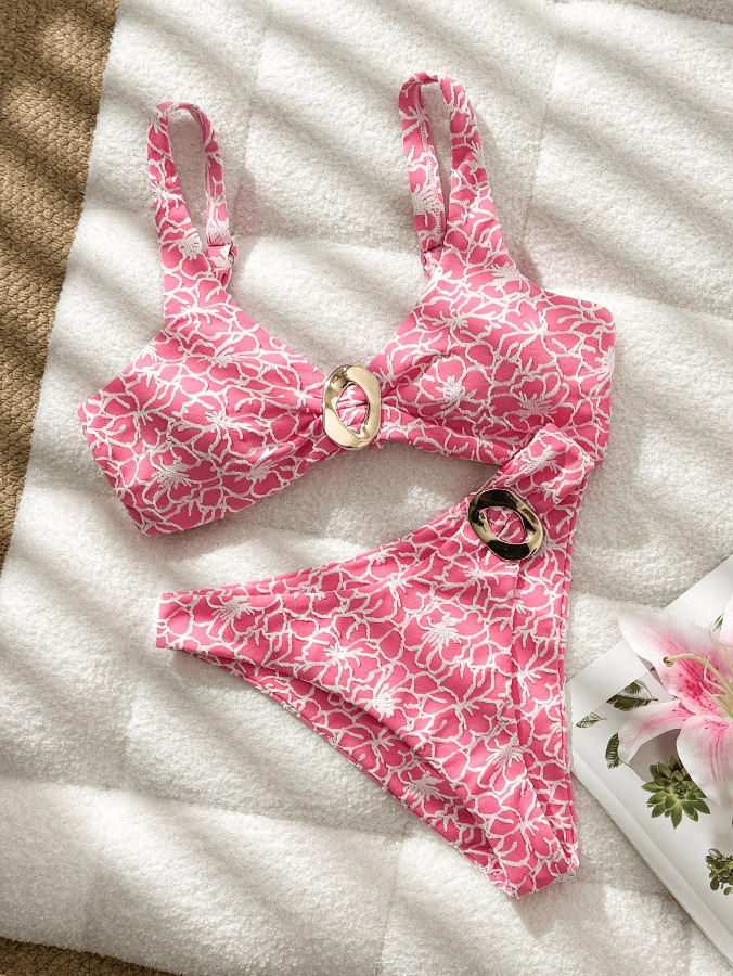
A color selected from a digital design file is not yet a production-ready color. The fabric and construction affect how a shade appears on the finished bikini.
Fabric surface and stretch can alter appearance
A smooth, shiny surface may reflect light differently from a matte or textured one. Stretching can also change the way fabric looks on the body. Seams, lining, binding, and hardware may create additional visual contrast.
Before confirming a shade, review it on the intended material and—where possible—on a sample with the planned construction. A small swatch is useful, but a sewn sample can reveal how the color behaves across seams and stretched areas.
Check prints at finished-garment scale
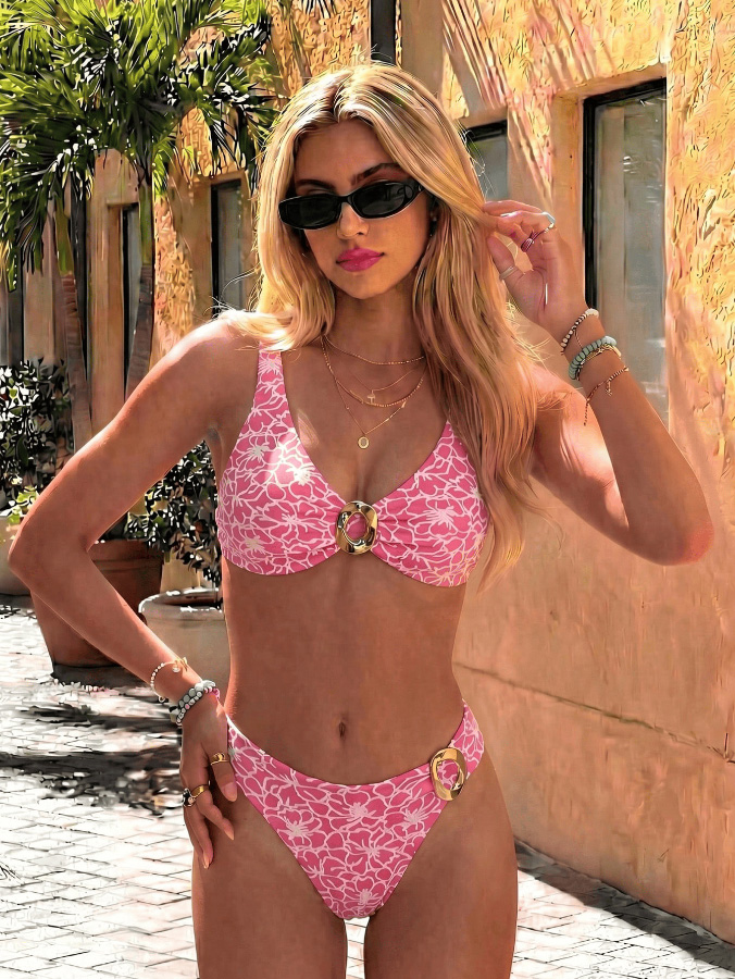
A print that looks balanced on a large screen may feel too busy—or lose detail—when cut into smaller garment panels. Review:
- Motif size: Are the shapes appropriate for the finished top and bottom?
- Contrast: Can the print be understood at a glance?
- Panel placement: Will important motifs land awkwardly at seams or edges?
- Color balance: Do the background and print remain distinct on the selected fabric?
- Set coordination: Do the top and bottom look intentional when worn together?
Approve print scale on a garment mock-up or sample, not only on a flat digital tile.
## How Swimwear Brands Can Approve Color Before Bulk Production
Color approval is one of the practical steps that helps reduce surprises between design and production. The specific process varies by material, mill, dye method, and supplier, so brands should confirm requirements with their production partners.
A practical bikini color approval checklist
1. Define the target shade. Record the color reference and identify the intended fabric and finish.
2. Request a physical swatch or lab dip. A screen preview is not a reliable substitute for viewing the color on the actual material.
3. Review under consistent lighting. Check the sample in daylight and the lighting relevant to your sales environment.
4. Compare against an approved reference. Keep the approved swatch available for later checks.
5. Review a sewn sample. Inspect seams, lining, straps, hardware, and stretched areas.
6. Confirm production expectations in writing. Document the approved version and clarify how color variations will be handled.
7. Recheck the bulk lot. Compare production material against the approved reference before shipment or final sign-off.
Practical expert tip: Keep a dated record of the approved color, fabric, finish, and sample. If a color is reused in a later season, confirm that the material and production conditions are still comparable rather than assuming the shade will match automatically.
What to include in a color brief for an OEM supplier
A clear brief can reduce avoidable clarification during sampling. Share:
- Style name or product code.
- Target color reference, if available.
- Fabric composition and surface finish.
- Whether the color is solid, color-blocked, or printed.
- Any matching trims, linings, or accessories.
- Intended sample stage and approval contact.
- Photos or physical references, with a note about their limitations.
For Dongguan Abely Fashion Co., Ltd., an OEM swimwear project should begin with the customer's intended market, product type, and reference materials. Confirm sample and color-approval arrangements directly with the factory for each project.
## Common Bikini Color-Selection Mistakes to Avoid
- Choosing from a screen alone: Displays vary, and the image may not represent the finished fabric.
- Treating skin-tone advice as a strict rule: Styling guidance is subjective; customers should be free to choose what they enjoy.
- Ignoring stretch and construction: A swatch may not show how the color reads on a finished, worn garment.
- Using too many competing shades: A collection can lose coherence if every item has a different visual direction.
- Approving a print only at full size: Check the design at the scale and placement of the finished bikini.
- Skipping a written approval record: Without a clear reference, later comparisons can become ambiguous.
## Suggested Images and Visual Assets
Use original images that clarify the decision—not decorative visuals that repeat the same message.
1. Color palette comparison: Show the same bikini silhouette in several solid colors against a neutral background.
AI image prompt: "Create a clean swimwear product-development mood board showing one identical women's bikini silhouette in six distinct solid colors: black, navy, coral, turquoise, sage, and cobalt. Neutral studio background, accurate fabric texture, consistent lighting, no text, no logos, editorial catalog photography."
2. Print scale comparison: Show one print at small, medium, and large motif scales on matching bikini mock-ups.
AI image prompt: "Create a professional swimwear design comparison with three matching bikini mock-ups featuring the same tropical print at small, medium, and large motif scales. Front view, consistent garment shape and lighting, plain light background, no text, no logos."
3. Color approval workflow graphic: Illustrate digital reference → fabric swatch → sewn sample → bulk review.
AI image prompt: "Create a clear horizontal infographic for a swimwear color-approval workflow: digital color reference, physical fabric swatch, sewn bikini sample, bulk fabric inspection. Minimal flat illustration, professional fashion manufacturing style, neutral palette, generous whitespace, no readable text, no logos."
## Make a Color Choice That Works for Both Customers and Production
For shoppers, the best bikini color is one that fits their taste, wardrobe, and intended use—not a shade dictated by a rigid chart. For swimwear brands, a successful color range balances customer appeal with fabric behavior, print execution, and production approval.
If you are developing a bikini, swimsuit, shorts, or other swimwear collection, contact Dongguan Abely Fashion Co., Ltd. to discuss your OEM requirements, product direction, and sampling process. Share your reference colors, target materials, and product brief so the team can confirm the next steps for your project.
## FAQ: Bikini Color Selection
1. What is the best color for a bikini?
There is no single best color for everyone. Choose a shade you enjoy and consider the garment's fabric, print, fit, and intended use.
2. How do I choose a bikini color for my skin tone?
Undertone-based suggestions can help you explore warm, cool, or neutral palettes, but they are not strict rules. Compare colors in natural light and choose what feels comfortable to wear.
3. Why does a bikini color look different from the online image?
Screens and lighting can change how colors appear. Fabric surface, finish, stretch, and photography can also affect the visual result. A physical swatch or sample gives a more useful reference.
4. How should a brand approve bikini colors for production?
Define the target shade, review a physical swatch or lab dip, inspect a sewn sample under consistent lighting, and keep a written record of the approved reference. Confirm the exact process with your supplier.
5. How many colors should a swimwear collection include?
There is no universal number. Many product teams plan a mix of core colors and seasonal options, then adjust the range to suit the customer, sales channel, and collection size.
6. What should I send an OEM factory when requesting a color sample?
Provide the product code, target shade or reference, intended fabric and finish, print or trim details, and any relevant sample requirements. Confirm color-approval steps directly with the factory.
## References
- The user-provided brief identifies Dongguan Abely Fashion Co., Ltd. and its OEM swimwear focus; no source article or customer reviews were included.
- HiViz Swim, "Boys' BLAZE Orange Swim Trunks with Boxer Brief Liner," product page. The page describes a specific product's fabric and UPF claim; it does not establish general color-selection or manufacturing rules. [Product page](https://hivizswim.com/products/boys-neon-orange-swim-trunks) [hivizswim](https://hivizswim.com/products/boys-neon-orange-swim-trunks)
Source limitation: The available search result supports only a product-specific UPF statement. This article therefore avoids making broad claims about color and UV protection, market-wide trend data, or universal production tolerances.